All case studies

CCO Magazine

CCO Magazine

I was commissioned to design a series of quarterly magazines for a car club based in Ontario. Previous issues relied heavily on generic online templates, lacking creative direction and visual cohesion. Collaborating closely with the editor, we built each page from the ground up — creating custom layouts that aligned with the CCO brand identity while adhering to universal editorial design principles.
A key focus was re-establishing the magazine’s visual language by addressing overlooked elements like typographic hierarchy, layout consistency, color palettes, and directional flow. The result was a publication that not only better represented the club’s values but also provided a more engaging, polished reading experience.

Company

Corvette Club of Ontario

Role

Lead Designer

Date

2022-2023

Elevating Editorial Design for Ontario's Premier Car Club

The second issue of the magazine marked a significant step forward in both design quality and visual storytelling. With a stronger emphasis on attention to detail and consistent thematic direction, the layout became more cohesive and engaging from cover to cover. To bring a sense of rhythm and distinction to each issue, I introduced a seasonal color theme — with cool blues for Winter, fresh greens for Spring, and bold reds for Summer — creating a visual identity that not only enhanced the overall aesthetic but also gave each edition its own unique character.

Refining Design Techniques

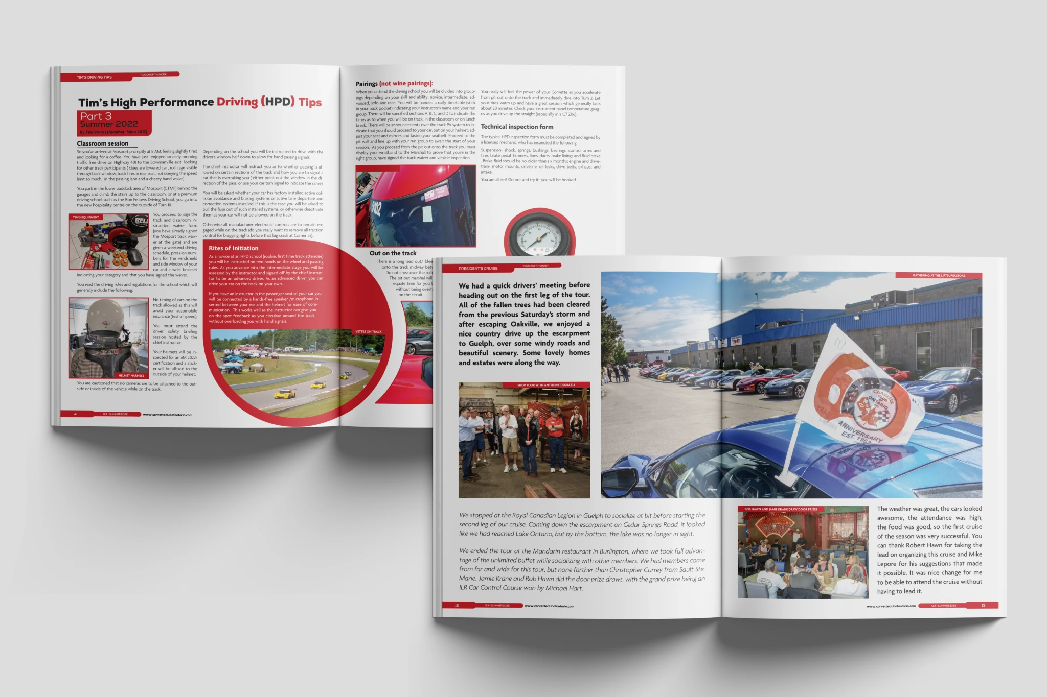
The third edition built on the foundation of the previous issues, pushing the design further with a more refined layout structure and dynamic compositions. This issue embraced bolder typography, stronger grid systems, and a more balanced use of white space, giving the content room to breathe. The established seasonal color theme continued with warm reds reflecting the energy of summer, tying the visual language together while adding a sense of progression across the series.

Keeping the Tradition

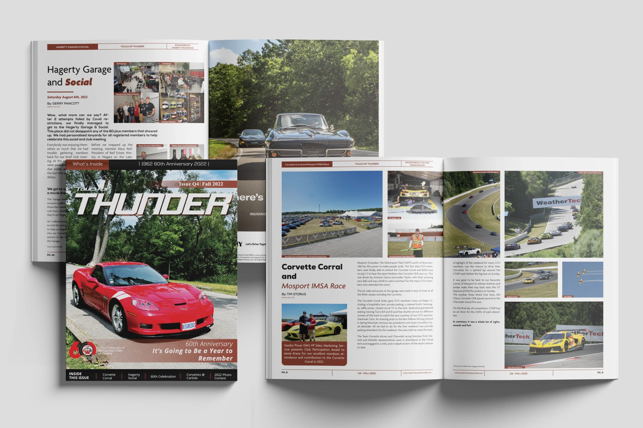
The fourth edition wrapped up the year's series with a more confident and cohesive visual style. With the seasonal color palette coming full circle, the rich red tones carried over to reflect the final stretch of summer, while subtle design refinements brought a more elevated, polished feel. This issue placed a greater focus on imagery and storytelling, with larger photo spreads and more intentional layouts that balanced text and visuals — further solidifying the magazine’s evolving design language.

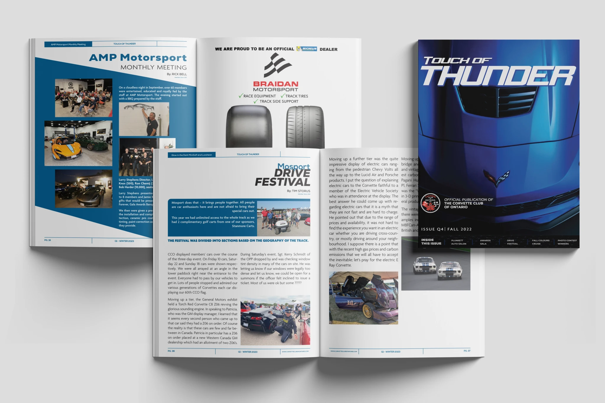
The first issue of the following year marked a fresh chapter, introducing cool blue tones to signal the return of winter and a new cycle of the series. This edition saw the design system fully realized, with a more consistent approach to typography, spacing, and visual hierarchy. With the foundations set from previous editions, the focus shifted to enhancing the reading experience, allowing the content and imagery to shine while maintaining the magazine's distinct brand identity.

Let's

Talk

Design is more than aesthetics—it’s the bridge between vision and impact. I love the challenge of turning ideas into compelling visuals that captivate, inspire, and leave a lasting impression.

Let's

Talk

Design is more than aesthetics—it’s the bridge between vision and impact. I love the challenge of turning ideas into compelling visuals that captivate, inspire, and leave a lasting impression.

Let's

Talk

Design is more than aesthetics—it’s the bridge between vision and impact. I love the challenge of turning ideas into compelling visuals that captivate, inspire, and leave a lasting impression.

Let's

Talk

Design is more than aesthetics—it’s the bridge between vision and impact. I love the challenge of turning ideas into compelling visuals that captivate, inspire, and leave a lasting impression.

Let's

Talk

Design is more than aesthetics—it’s the bridge between vision and impact. I love the challenge of turning ideas into compelling visuals that captivate, inspire, and leave a lasting impression.