All case studies
Company
Red Leaf Truck Lines
Role
Lead Designer
Date
2021

Bringing the Brand to Life
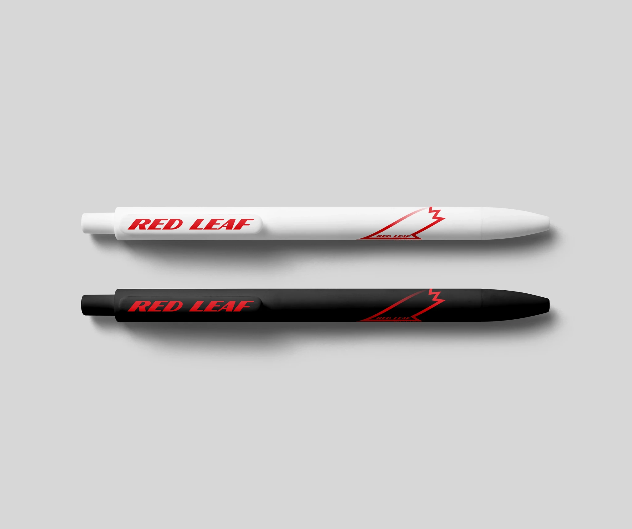
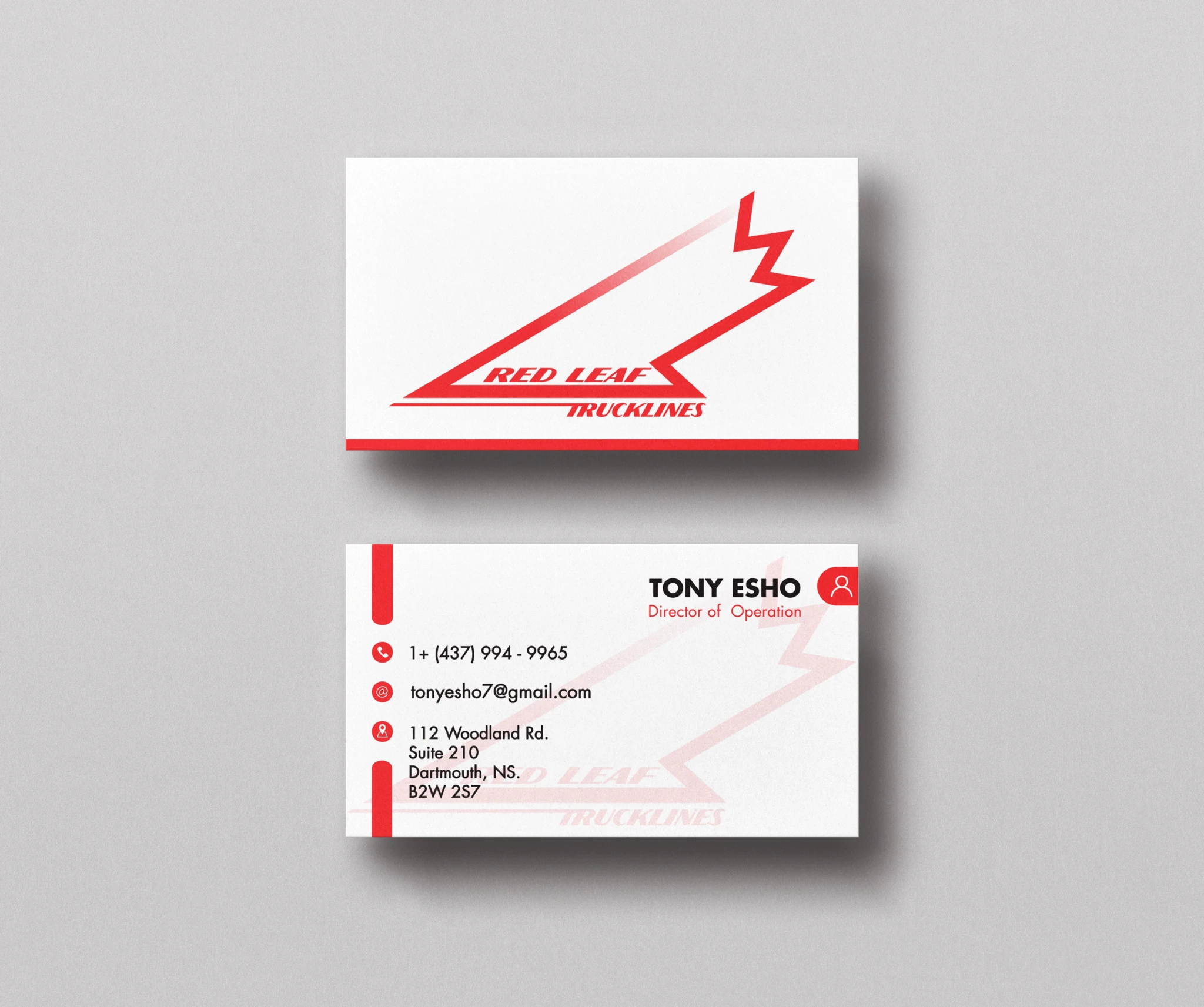
Once the branding for this project was finalized, the next step was bringing it to life across various applications. The first priority was designing and implementing truck decals, ensuring the brand was highly visible on the road. From there, the focus shifted to smaller branded materials, including pens, stationery, and other promotional items. These elements helped reinforce brand awareness and maintain a consistent visual identity across all touchpoints, creating a strong and professional presence for Red Leaf Truck Lines.

A Cohesive Brand Identity
The corporate identity of Red Leaf Truck Lines was designed to be bold, professional, and instantly recognizable. The stationery, including business cards, letterheads, and envelopes, was crafted with a clean and modern aesthetic that reinforced the brand’s strong presence. A consistent color palette, typography, and logo placement ensured a unified look across all materials. Branded items such as pens, notepads, and invoices further extended the company’s visual identity, creating a polished and cohesive brand experience both internally and externally.

Keeping it Simple
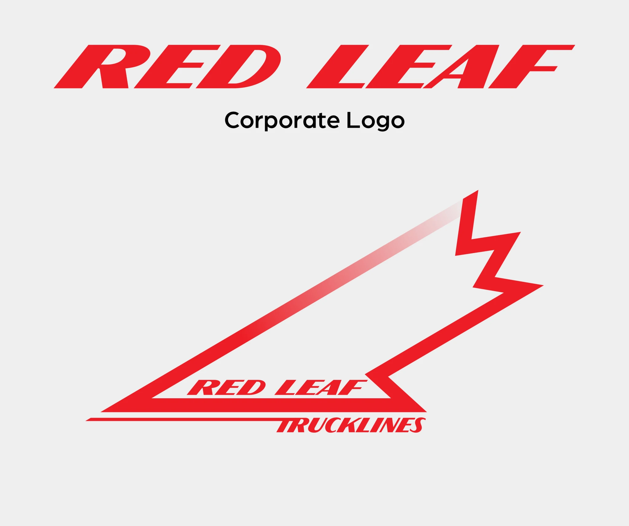
Ultimately, the customer’s needs come first. This brand discovery embraced the principles of simplicity and "less is more," resulting in a clean, impactful identity. The goal was to create a design that was straightforward, unmistakably Canadian, and visually striking.